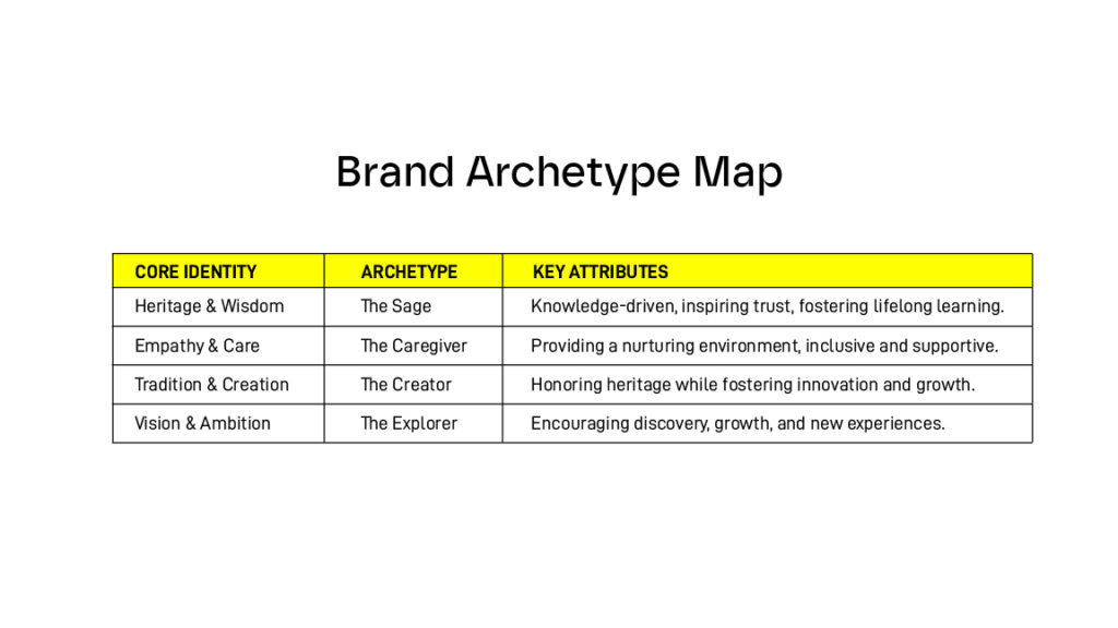
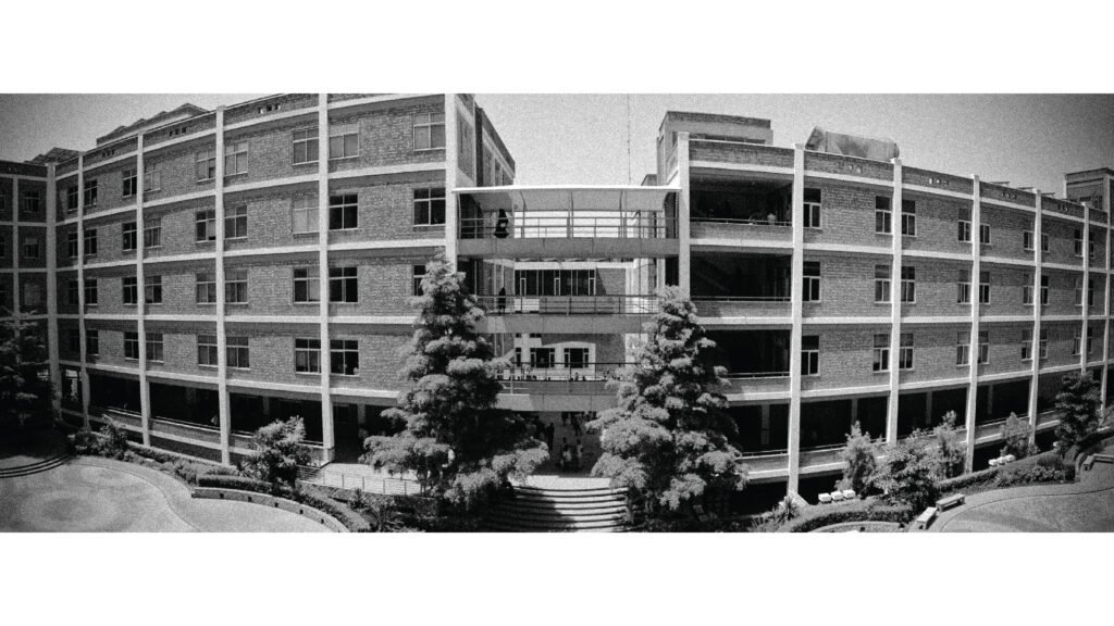
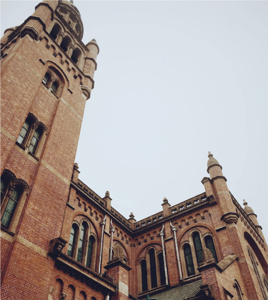
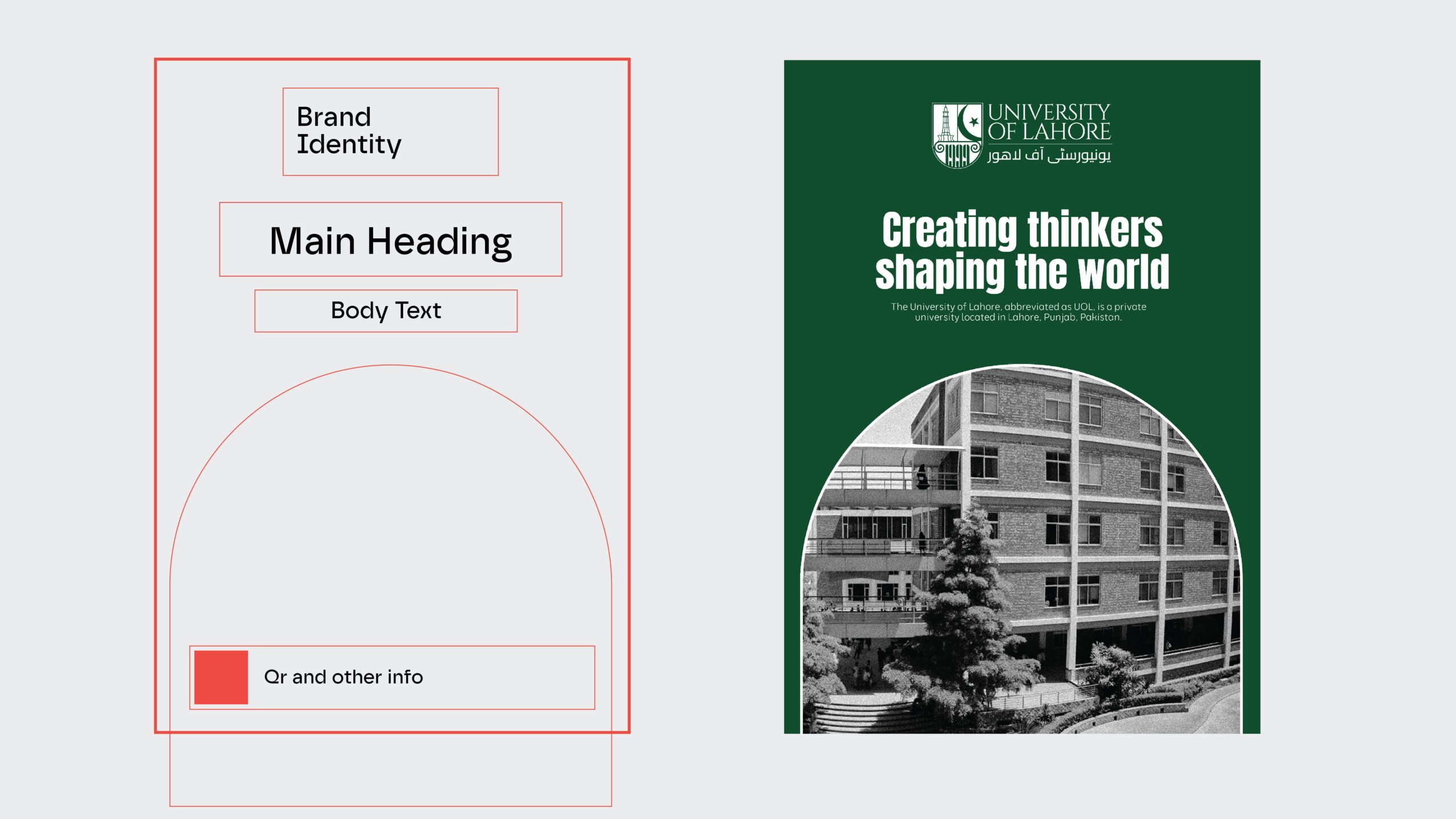
The University of Lahore is one of the country's most prestigious institutions of higher education.
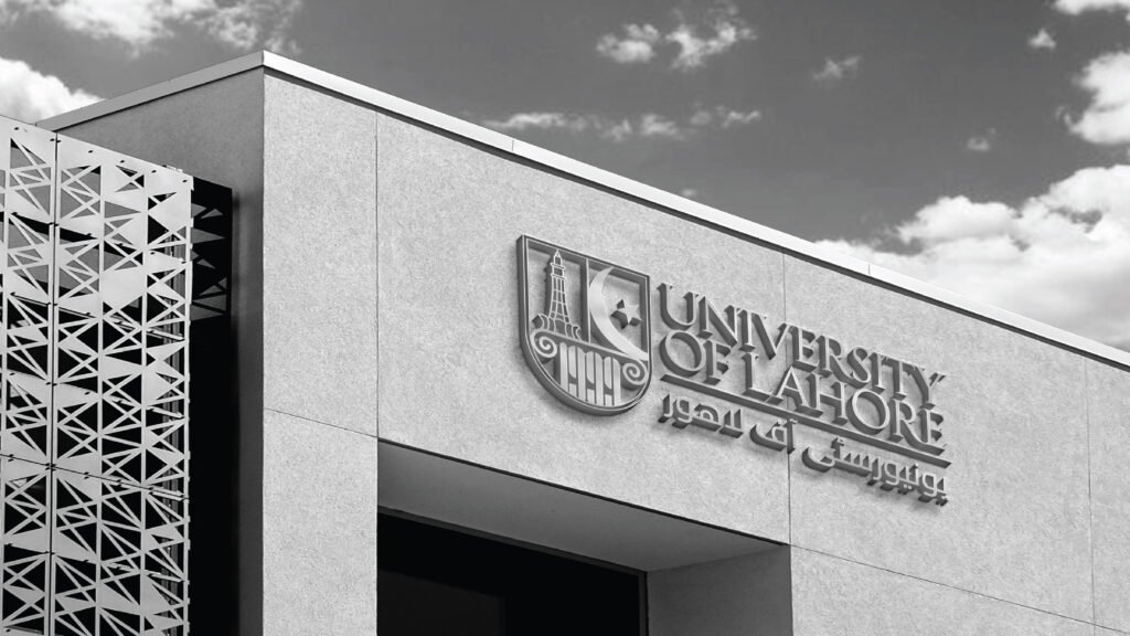
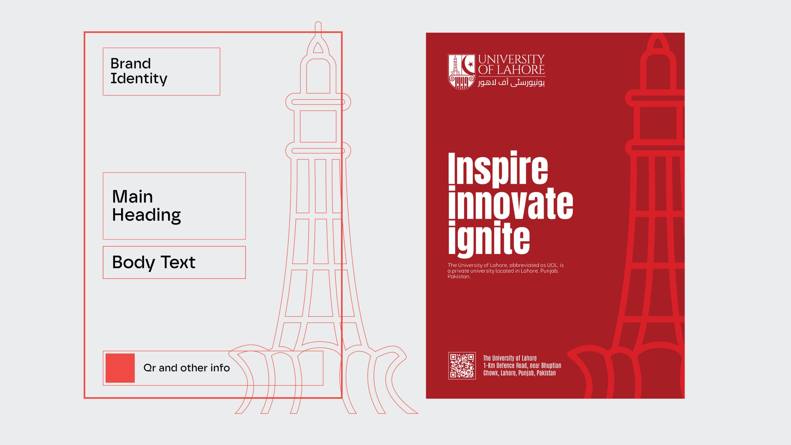
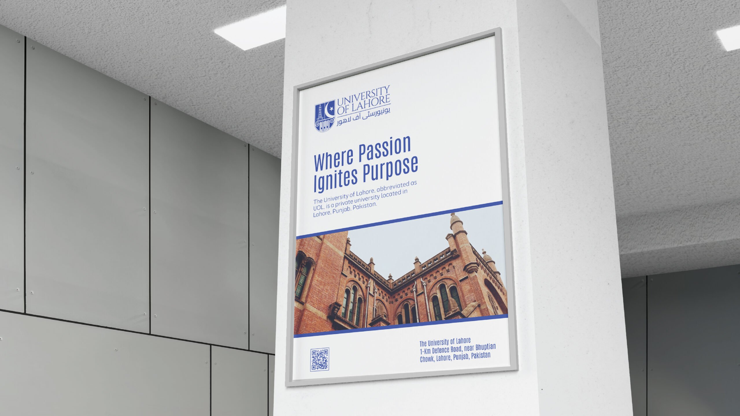
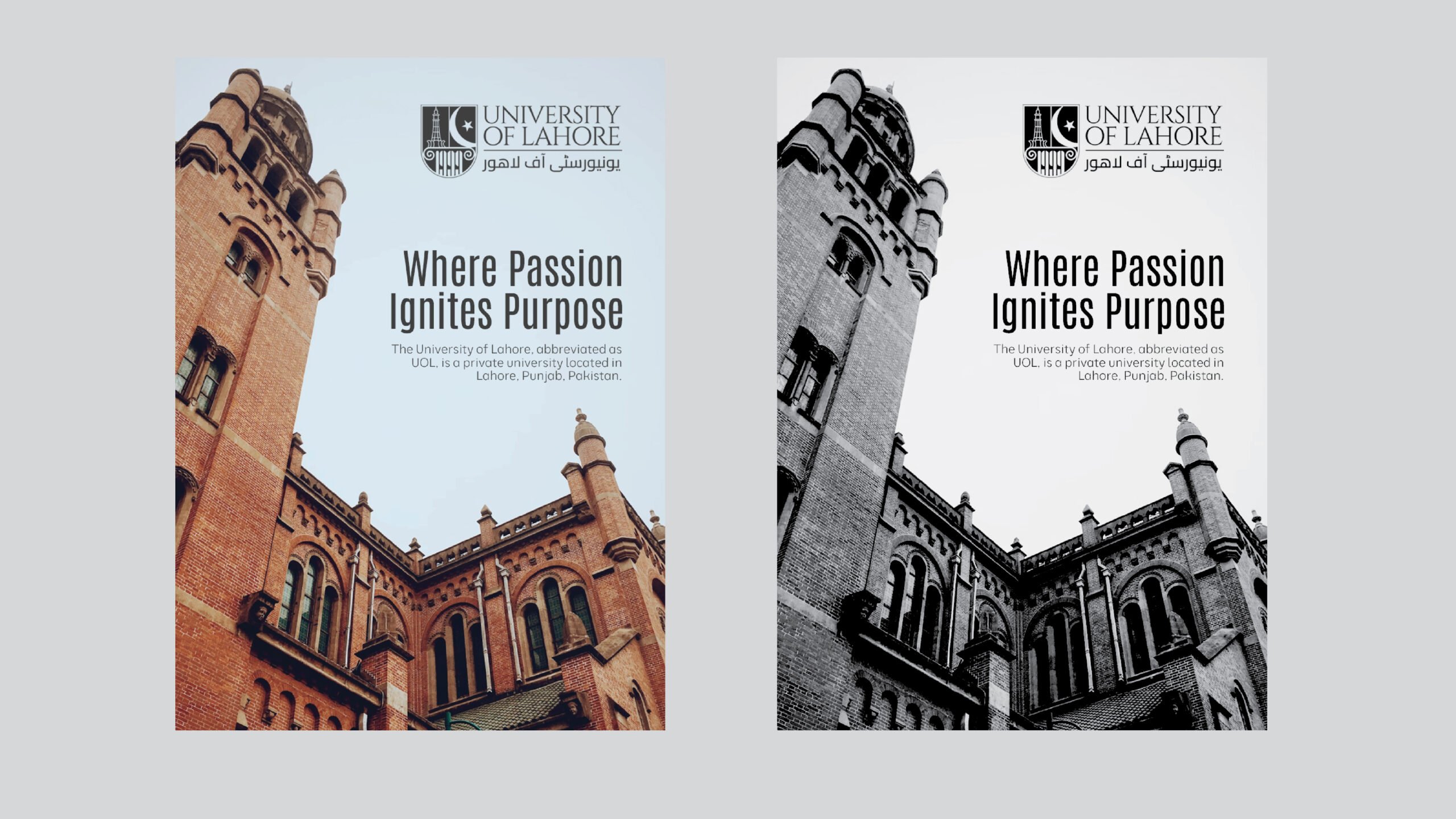
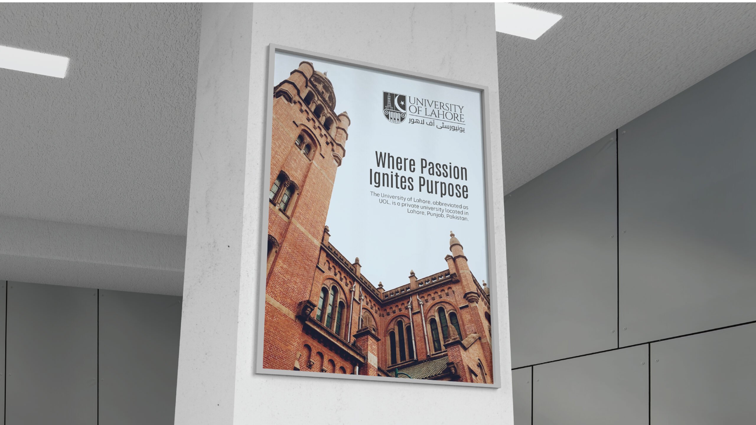
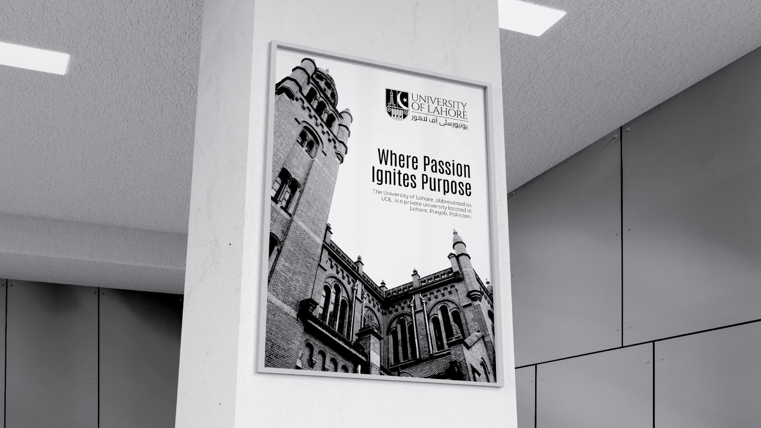
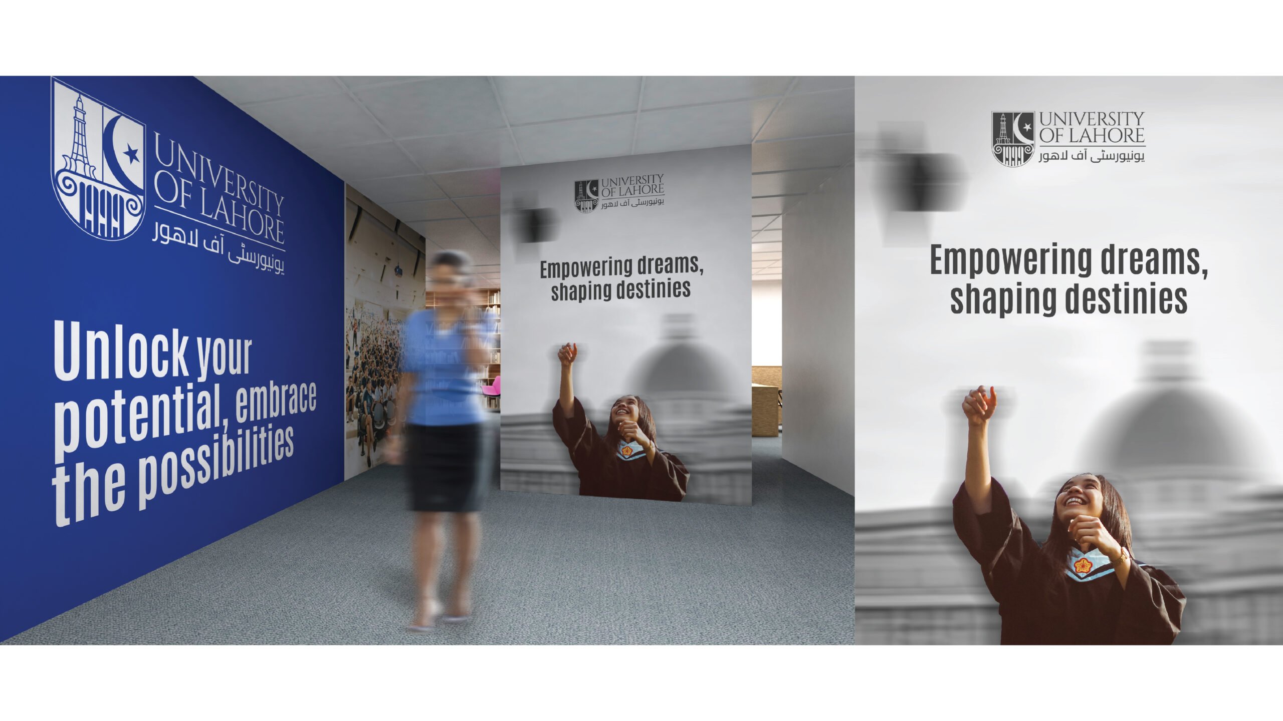
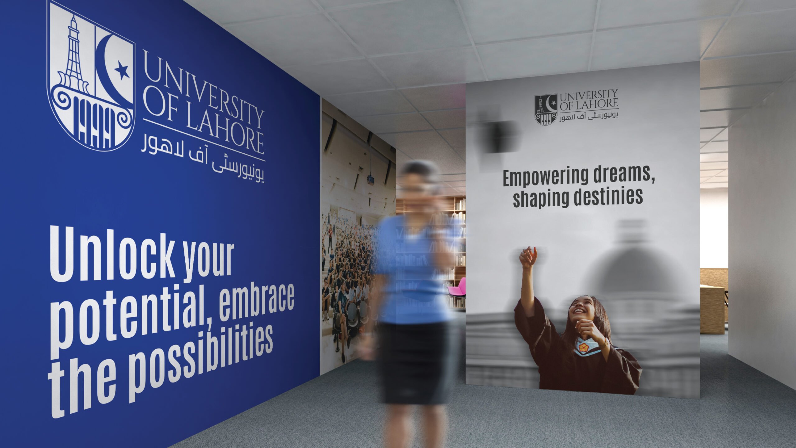
As the university was undergoing a change in leadership, we worked with the senior team to develop a new strategy and brand identity that would help drive the institution towards becoming the first choice university within 25 years. By combining modernity with elegance and classic touches, we manage to convey the university's timeless character at every touchpoint, as well as their innovative and quintessentially British approach towards education. The brand’s visual identity adopts a new carefully constructed design system that builds on the institution’s dynamic yet professional persona.
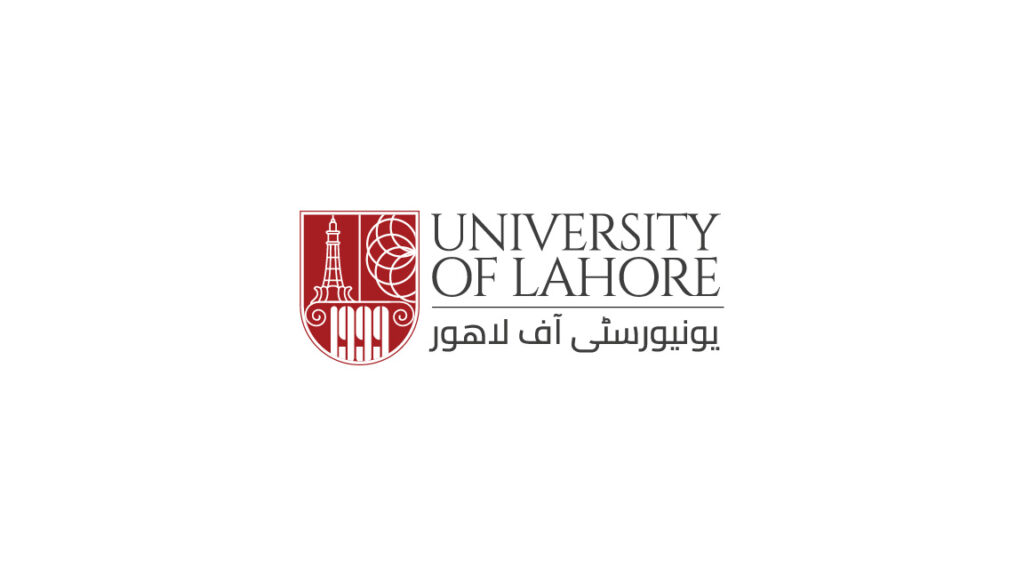
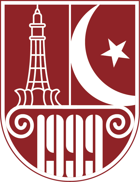
Old & new version logo
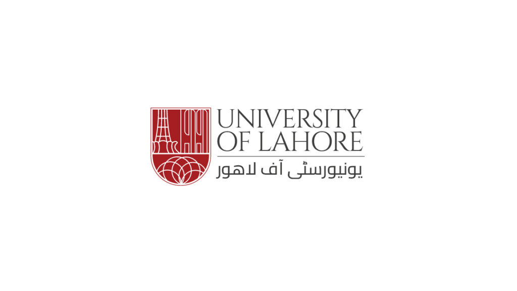
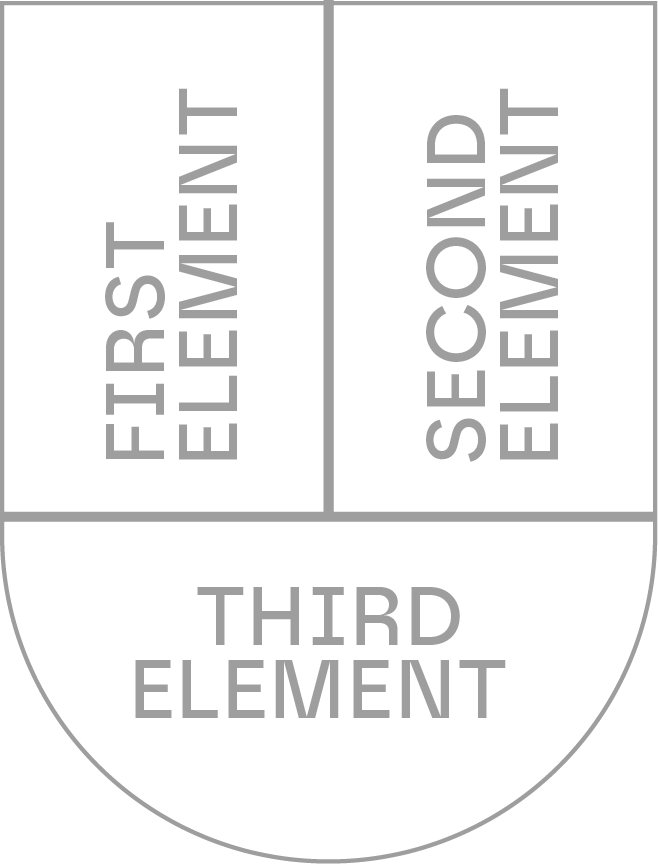
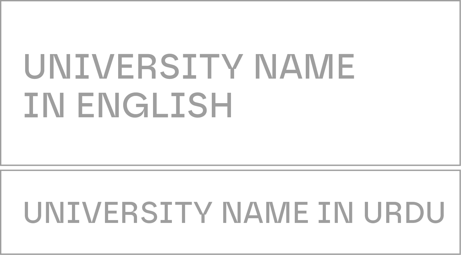
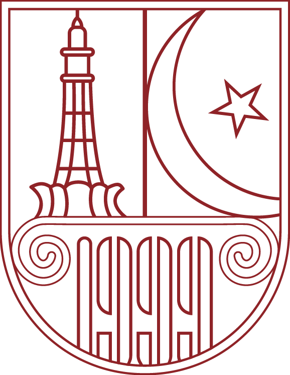
Logo breakdown
Logo Elements
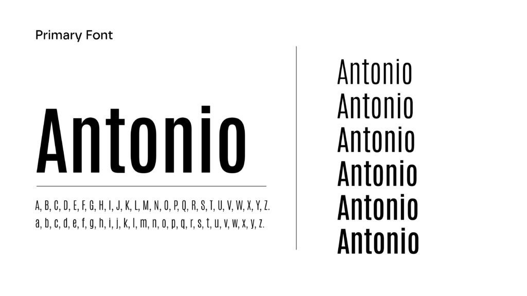
Logo typeface
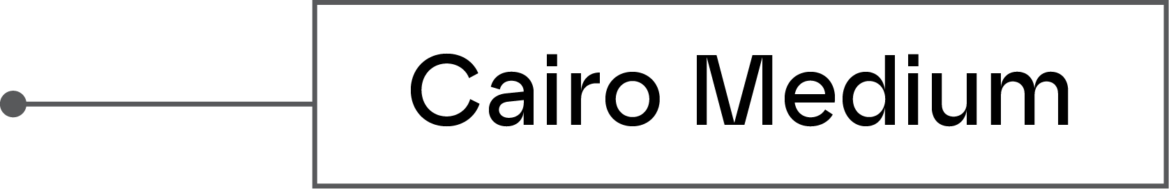
Cinzel & Cairo
Cinzel
Cinzel is a contemporary typeface that draws inspiration from classical Roman inscriptions, blending traditional serif elegance with modern design principles. It's characterized by its crisp, sharp serifs, and geometric construction, offering a timeless yet contemporary feel.
Cairo
Cairo is a contemporary multilingual typeface family. Mohamed Gaber extended the Latin typeface family Titillum Web to support the Arabic script, with a design that is based on the Kufi calligraphic style.
Emblem with different shapes
Logo Vertical & Horizontal
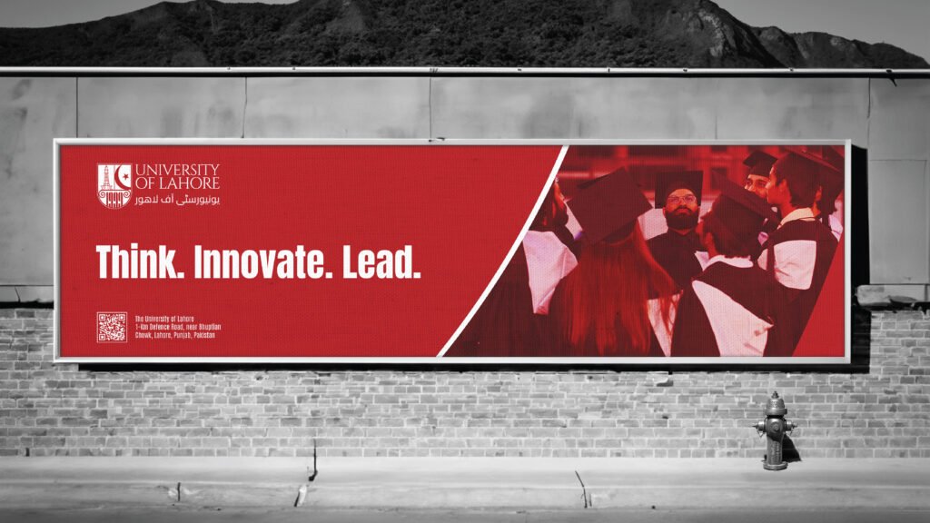
Think.
Innovate.
Lead
As the university was undergoing a change in leadership, we worked with the senior team to develop a new strategy and brand identity that would help drive the institution towards becoming the first choice university within 25 years.
Think.
Innovate.
Lead
The Shish Mahal (Palace of Mirrors) was built for the empress and her court and installed with screens to conceal them from prying eyes.